Surprise! A Fresh New Look for AnimeTracker 🎉
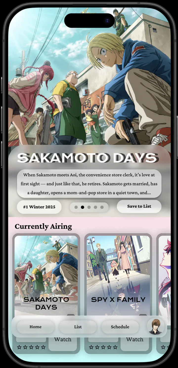 Image credit: [Taha Rashid]
Surprise! My app has a new look! 😎
Well, not quite yet. In the small free moments I’ve had between studying for midterms 📚, I’ve been slowly but surely working on some new Figma mock-ups for my AnimeTracker App.

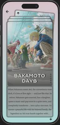
Inspired by VisionOS & Glassmorphism ✨
The new design takes inspiration from Apple’s VisionOS 🥽 and a glassmorphic aesthetic. The app now has a modern, frosted-glass look that I’m really proud of!


The “Card” Theme 🃏
My design theme revolves around “cards”, making the user experience more visual and interactive. Here’s how I’ve incorporated this concept:
- Shows are displayed as individual cards.
- Watchlists are shown as a stack of cards.
- Info cards provide details about each show.


New Interactive Section 🎞️
I’ve also added a new section inspired by Instagram’s Reels 🎞️ and Steam’s Discovery Queue 🔎. In this section, users can explore shows in a deck of cards. After a few seconds, the trailer for each show starts to play 🎥. Users can then quickly dismiss or add shows to their watchlists.
What’s Next? 🚀
I’m excited to refine these designs even further and implement them sooner rather than later. But first, I need to focus on launching the app 😅.


👉 I’d love to hear your thoughts and feedback! What could I change? What should I add? Do you like the new design?
Let me know in the comments below!