Devlog: Feb 22, 2025
AnimeTracker
- Going back to Ottawa tomorrow :(
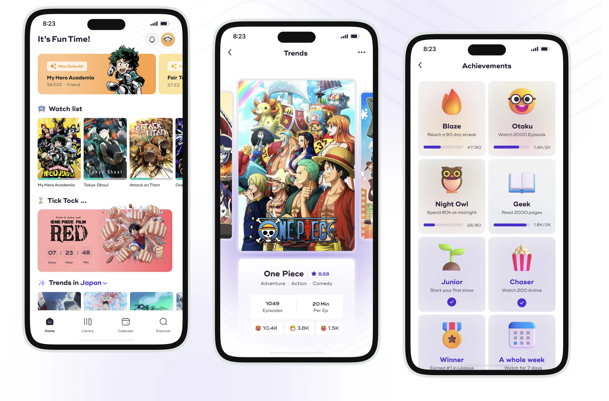
- I want to have a consistent UI design across all of my clients
- Something nice, clean, modern.
- I think a smooth, glassy (glass morphism) appearance is good (like the new Apple Apps)
- Need to also figure out app colour theme
- Need to also properly flesh-out our features/the pages we want
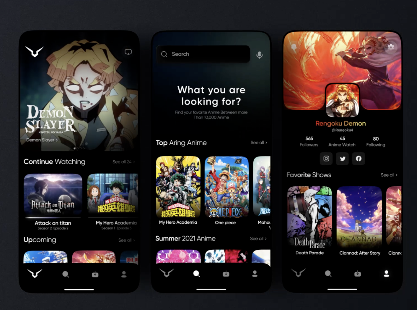
Here are some app inspirations:
-
Themes
- Krona One for big text
- Lateef for smaller/less important text
- Background colors: FFDEE9 (Pink), B5FFFC (blue)
- Highligh colors: #98A8F8 (purple), #6FBEFF (blue)
- Progress bar: #E10F0F (red), #29E753 (green)
-
I need to add shadow to each card (this makes it pop)
- Not really a shadow, but a GLOW!
- I added these shadows to each card, as well as different shadow depths for each button depending on importance/call to action and size
- This totally fixes the “flat” issue and makes it have way more depth!
-
I want that when we click the details button, we stay on the same page BUT instead of showing the anime’s box image, we show the anime’s details instead
- A flip animation?
- Completely blur the anime and “spawn in” the description text?
- Like this card flip animation: https://medium.com/@nikhil.vinod/create-a-card-flip-animation-in-swiftui-fe14b850b1f5
-
For the highlight
- Details button: we can click it and it will pop up a bigger view for the description (like Apple TV) blurring everything behind it
- User ratings: the anilist/mal ratings (like #1 winter 2025)
- Save Icon: Shows a bookmark icon, adds to your “saved” list
- If you click on the actual anime image, it takes you to the anime’s details itself (separate view)